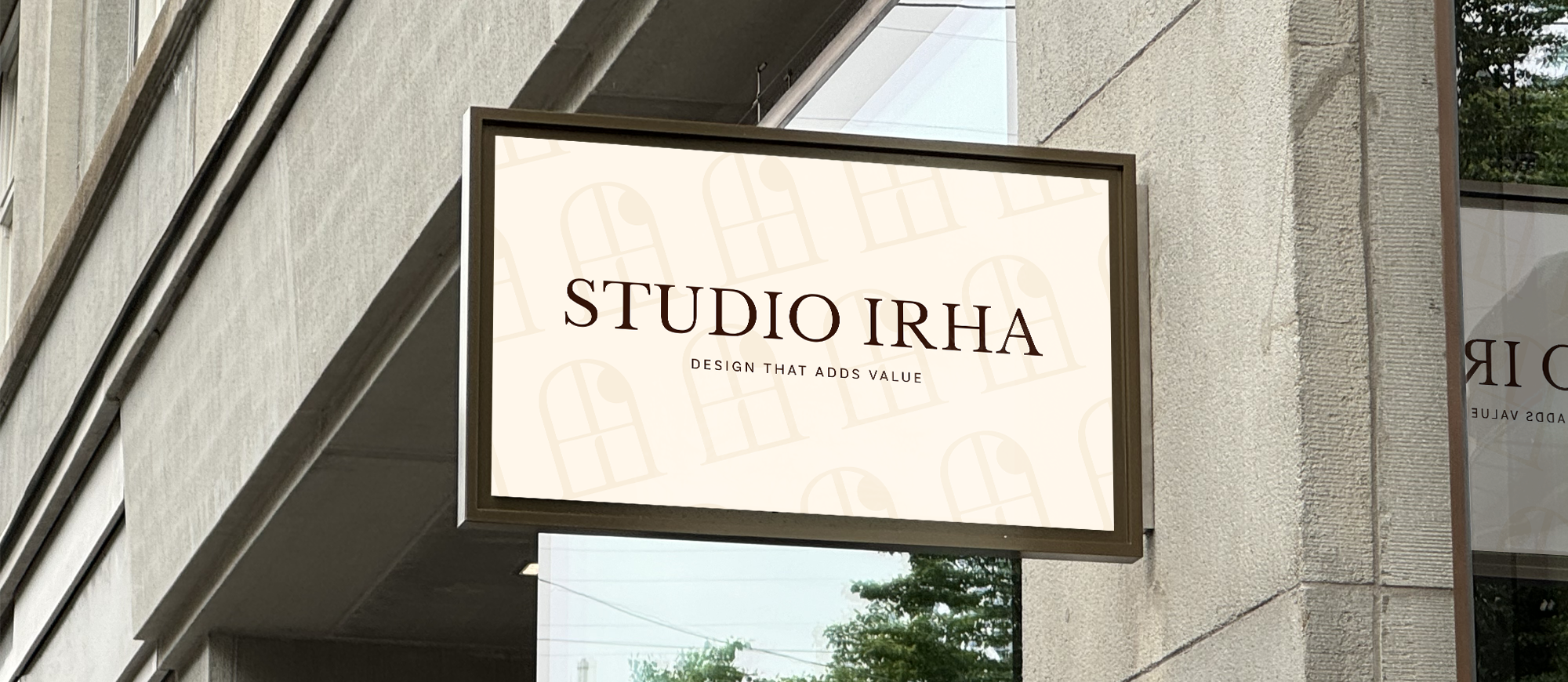
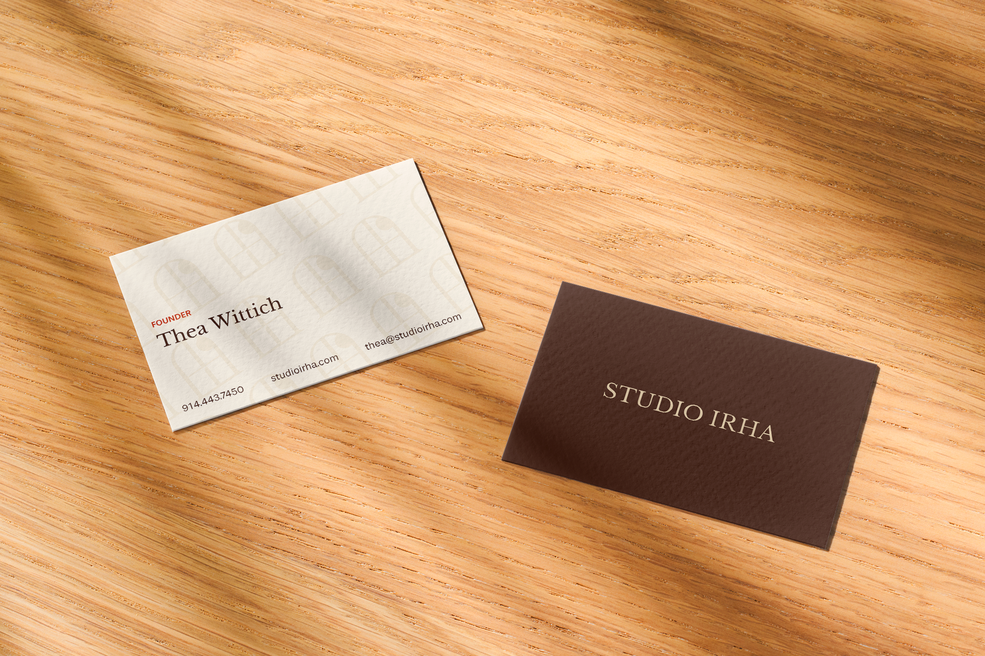
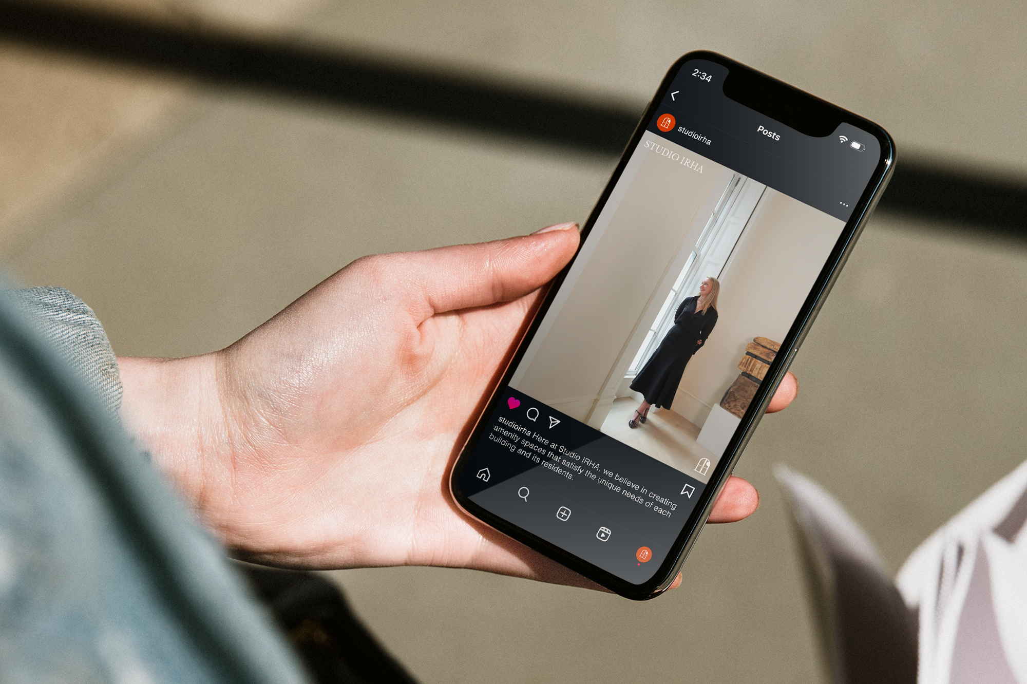
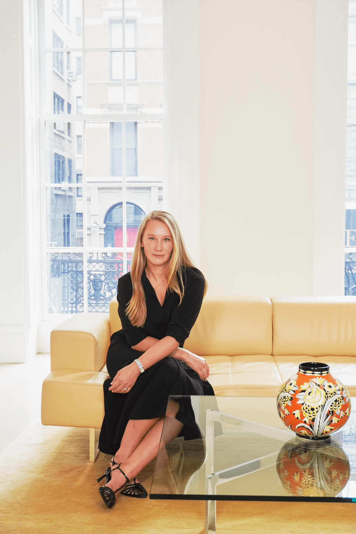
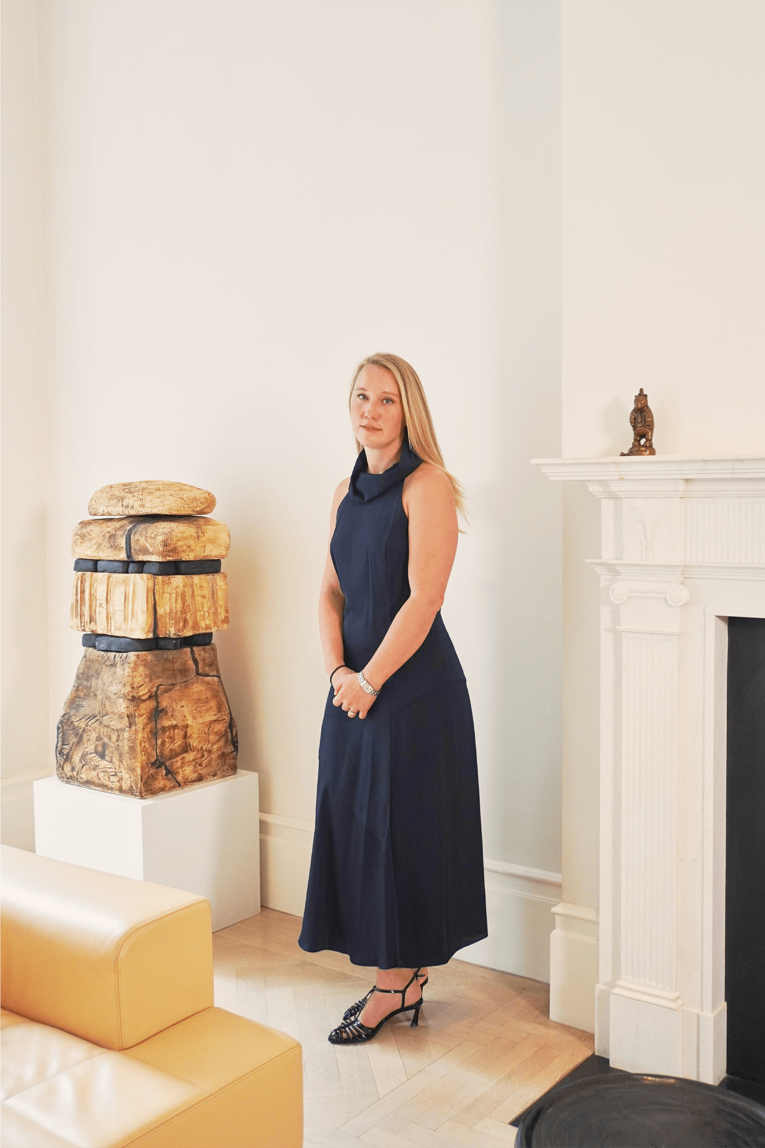
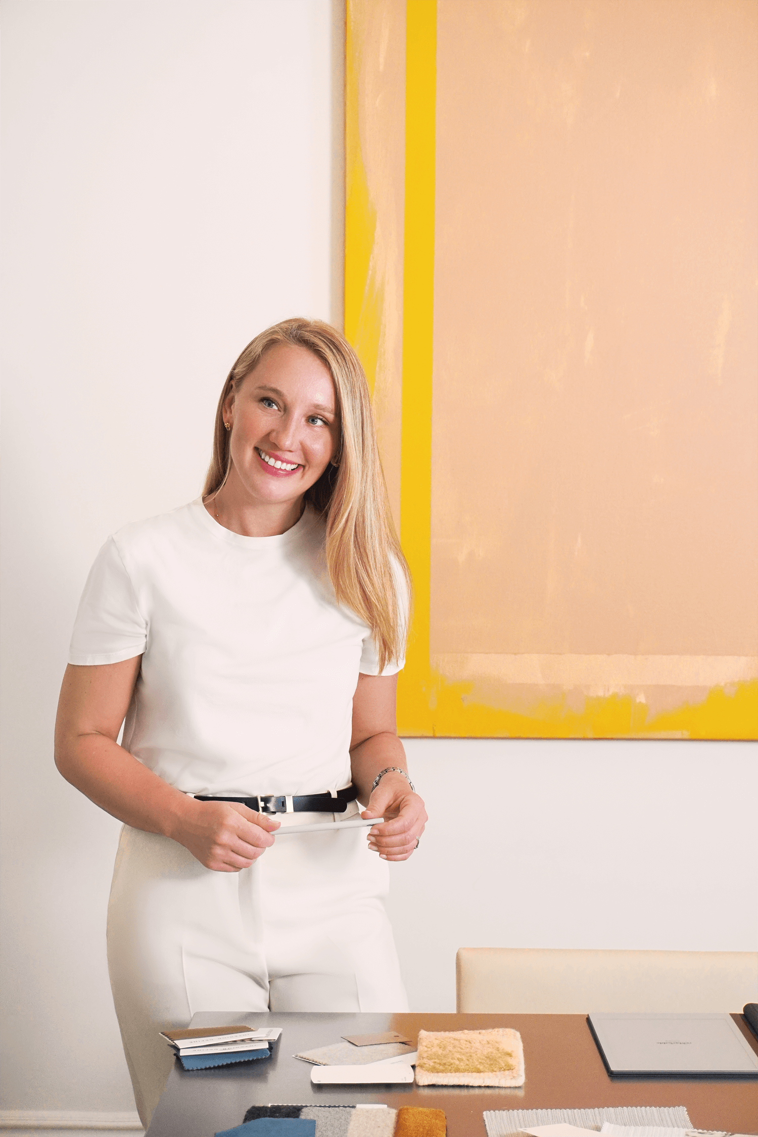
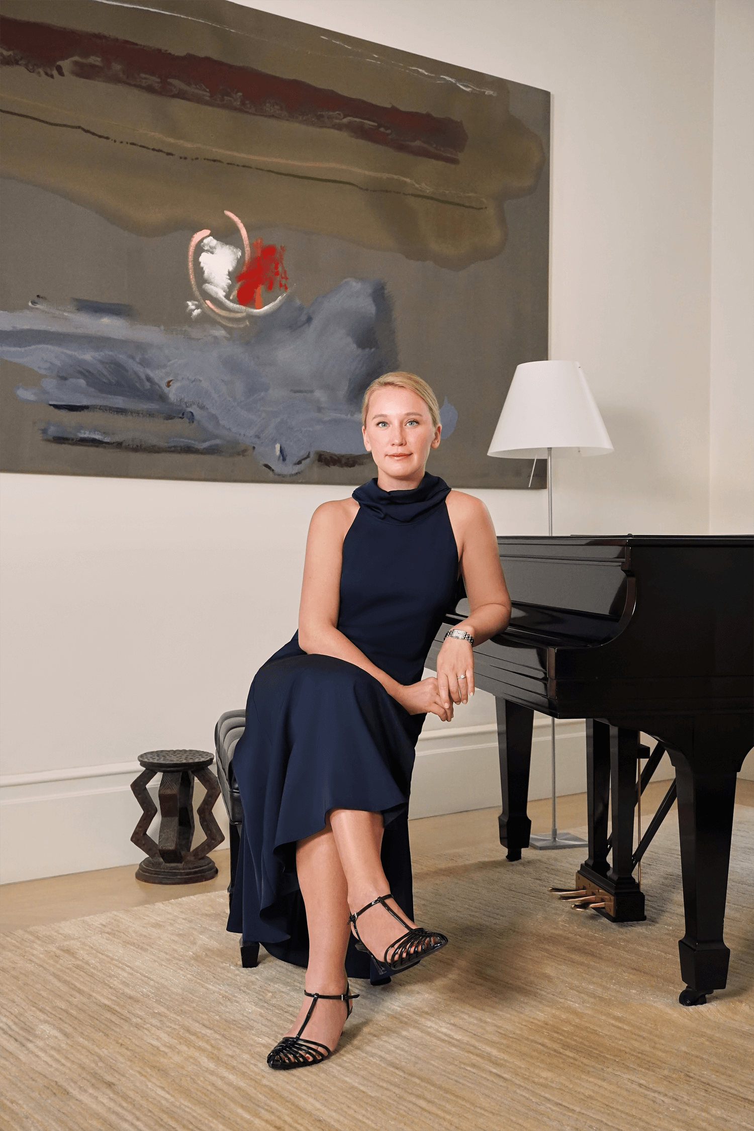
EHL & Co. developed the brand identity for Studio IRHA, an architectural design firm creating luxury amenity spaces for residential, commercial, and hospitality projects. The objective was to create a calm and elevated presence that reflects IRHA’s data-informed and community-focused approach to design. Our solution translated the firm’s strategic process into a timeless brand language that communicates both sophistication, peacefulness, and added value.
Branding & Identity, Creative Direction, Graphic Design, Image Retouching, Media Production, Photography, Video Editing, Website Design & Development
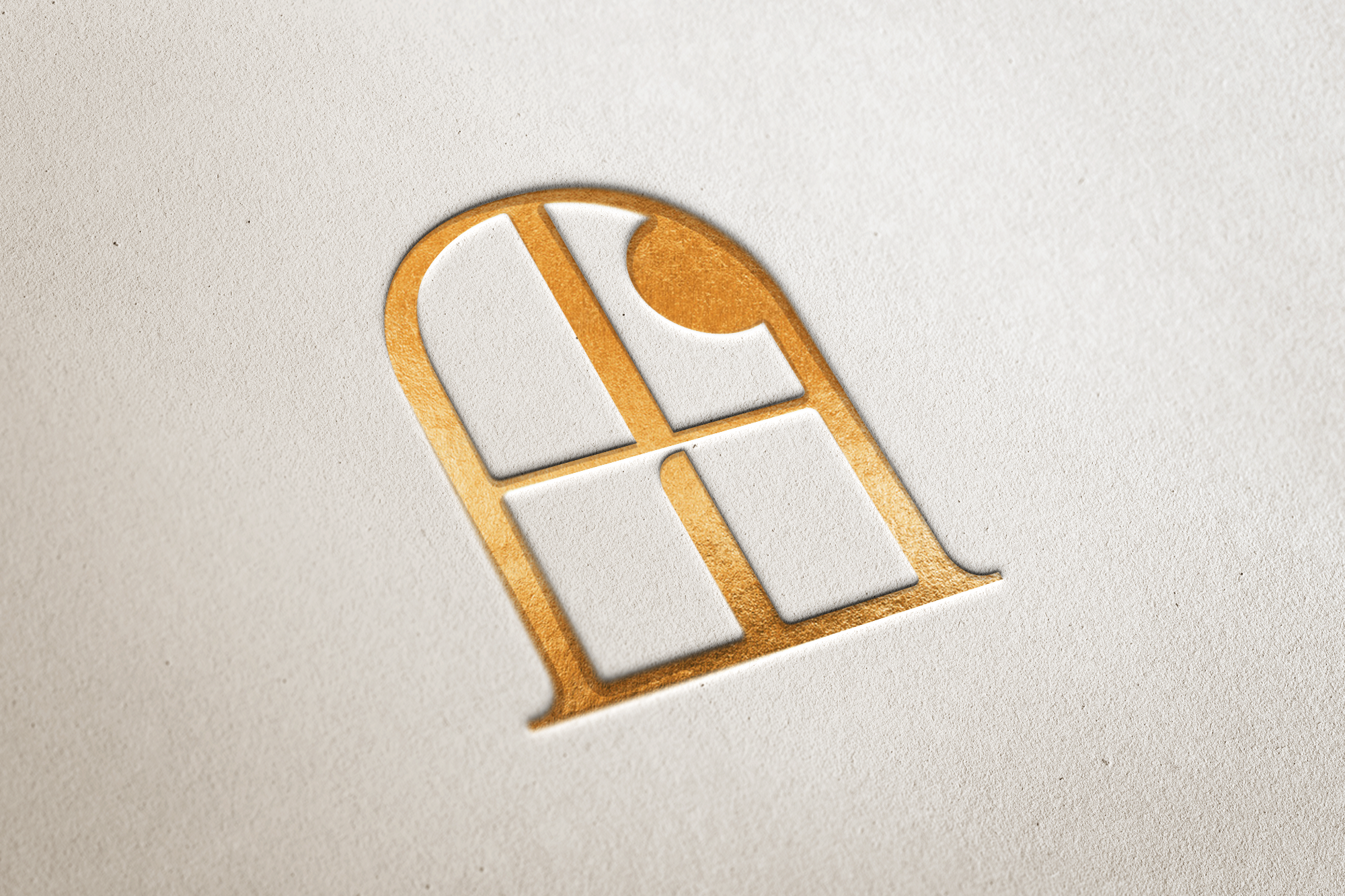
The identity centers on a window symbol, an easily recognizable architectural element that also represents looking out or into a new space. A rising sun completes the mark, representing how IRHA draws out the full potential of each project, from new builds to historic restorations. Refined serif typography reinforces the brand’s prestige and distinguishes it from industry competitors who largely use minimalist sans serifs.
The copy was developed to reflect founder Thea’s voice by remaining straightforward and assured, as though the firm had been established for years, while also kind and approachable in tone. This balance honors her care for each communities’ unique spaces and emphasizes Studio IRHA’s unique method of researching properties through data-driven insights. The result is a cohesive visual system that captures the luxury, permanence, and personalized service Studio IRHA brings to every space.
