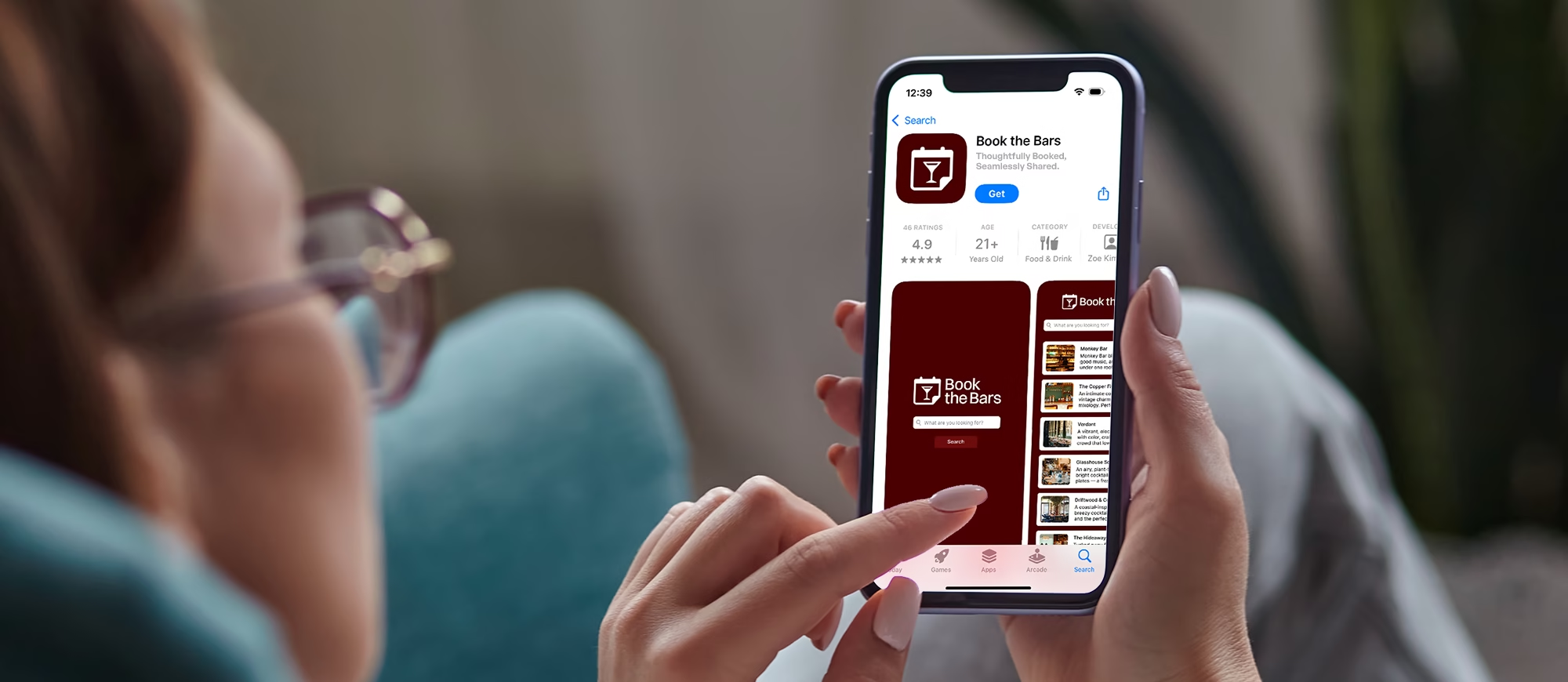
EHL & Co. developed the visual identity for Book the Bars, an app designed to simplify how corporate teams plan their social gatherings. Positioned as the Airbnb of booking venues, the platform enables planners to effortlessly reserve bars for team nights, happy hours, and dinners. The brief called for a logo that felt as sophisticated as the clientele it served, sleek, intelligent, and modern, while still carrying the energy and ease of social connection.
Branding & Identity, Graphic Design
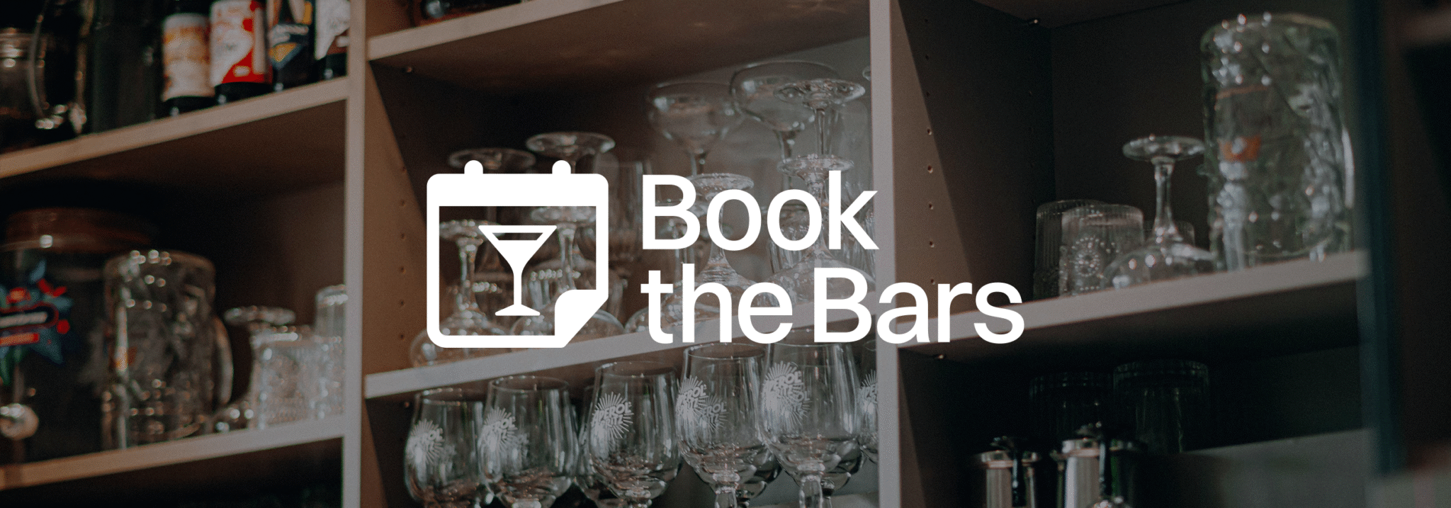
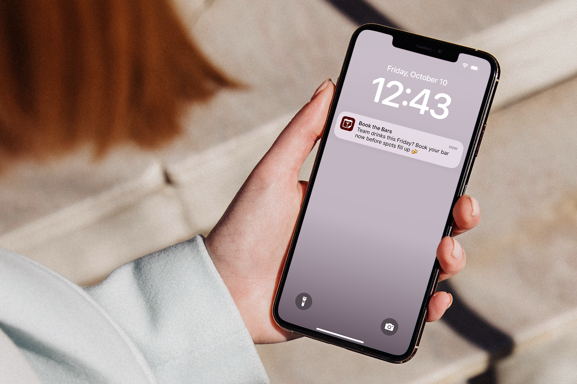
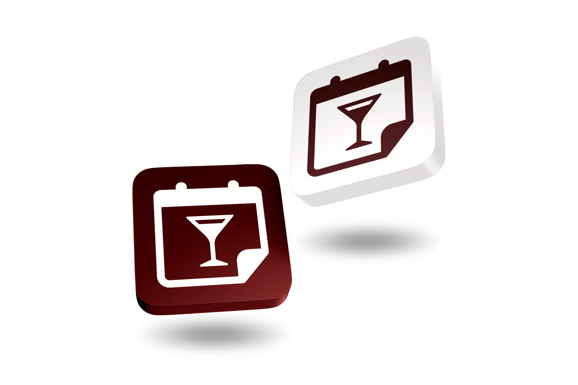
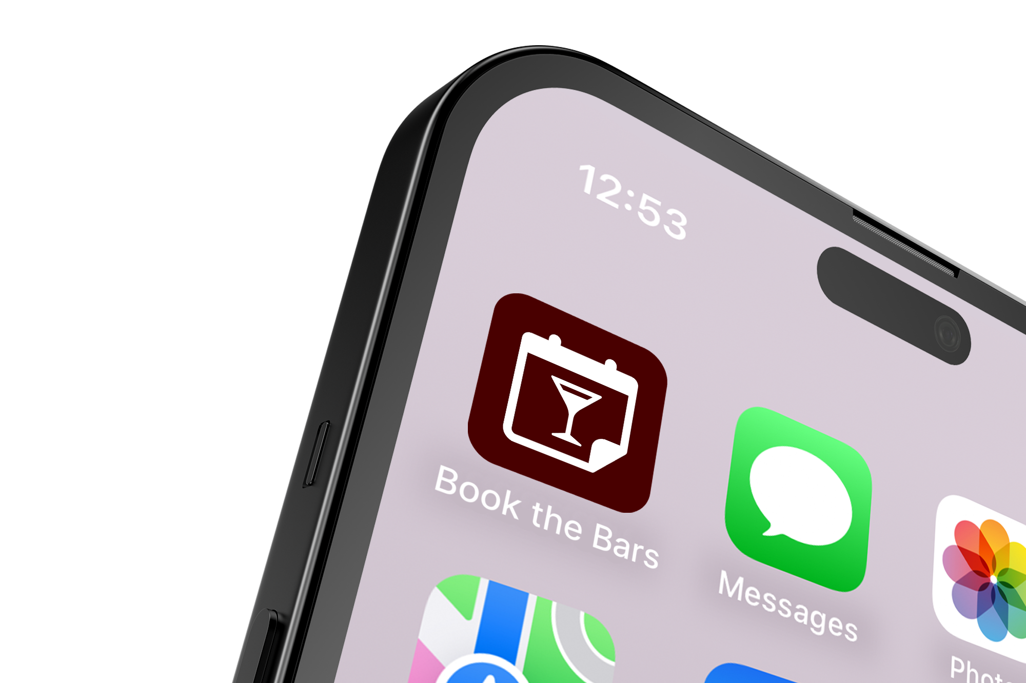
The creative solution was a refined yet memorable logo system: a calendar icon featuring a martini glass, symbolizing that the next great night out is already on your schedule. The detail of the upturned corner invites the viewer further into the app. The illustration is pared back for legibility at app-icon scale but retains a sense of liveliness through its balance of line and negative space. Complemented by tightly kerned, character-filled typography, the logo achieves visual harmony between function and flair, creating an efficient symbol that will stand out among leading lifestyle and dining platforms.