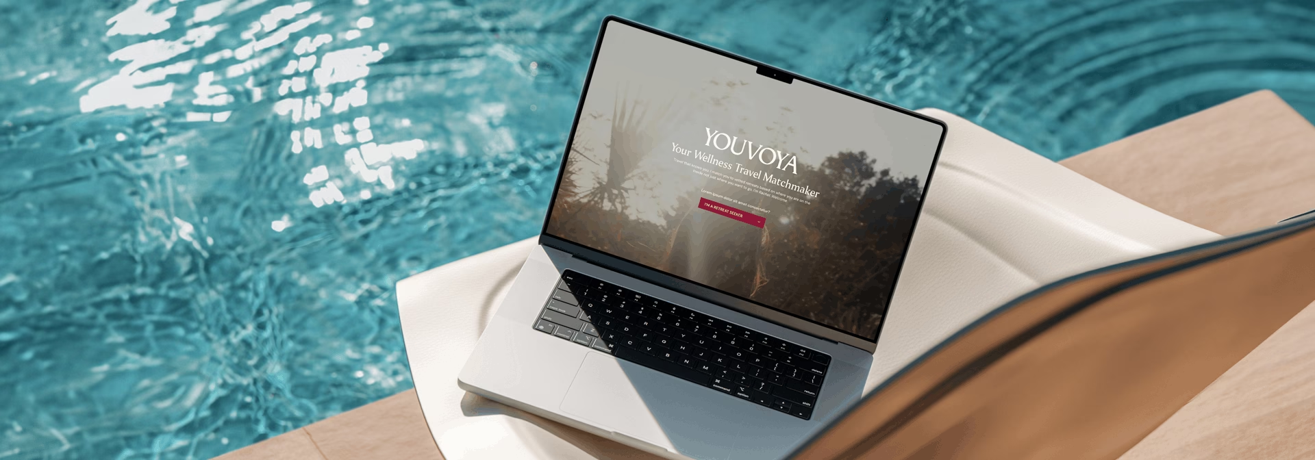
EHL & Co. partnered with founder Rachel Meade to build a brand identity for her wellness matchmaking service, connecting wellness seekers with retreat leaders. The brand needed to feel grounded and welcoming to the women seeking guidance, while reading as legitimate and established to the professionals Rachel works alongside. Above all, the identity had to capture Rachel’s own energy, the specific feeling of being met and understood that defines her approach.
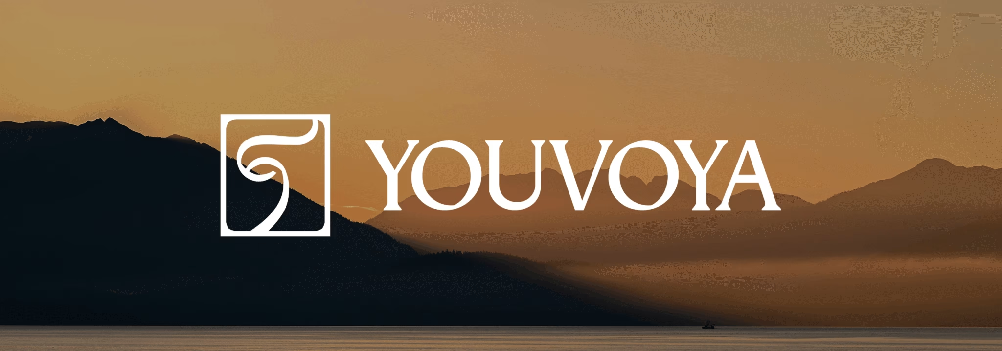
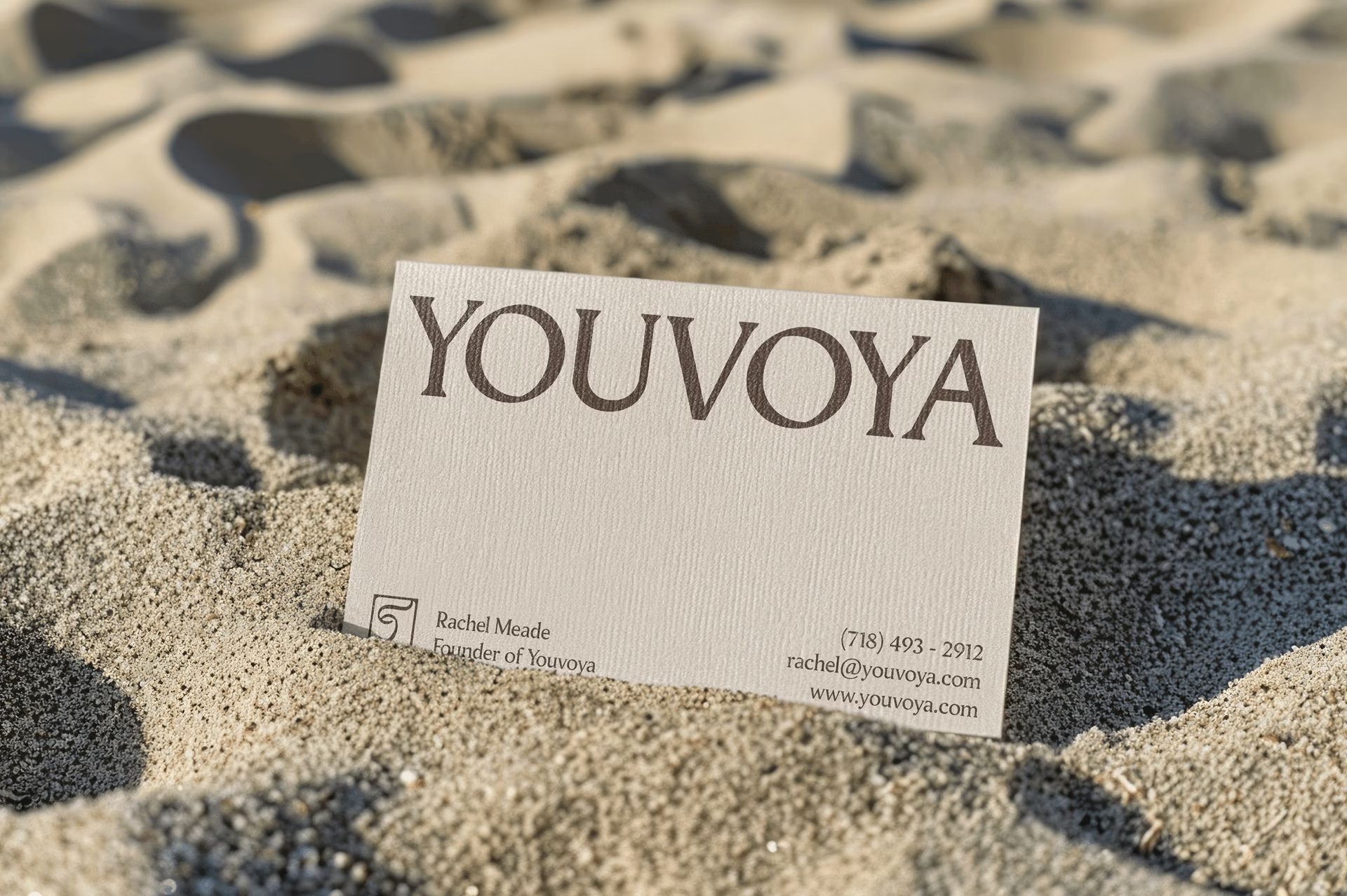
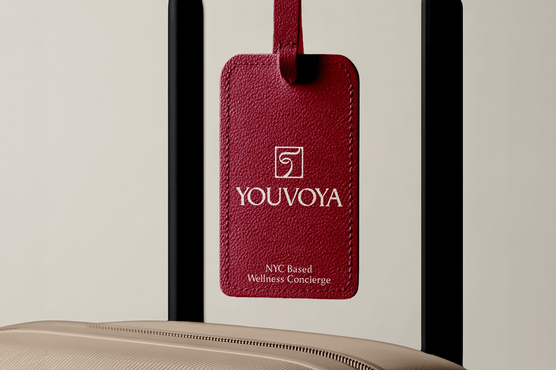
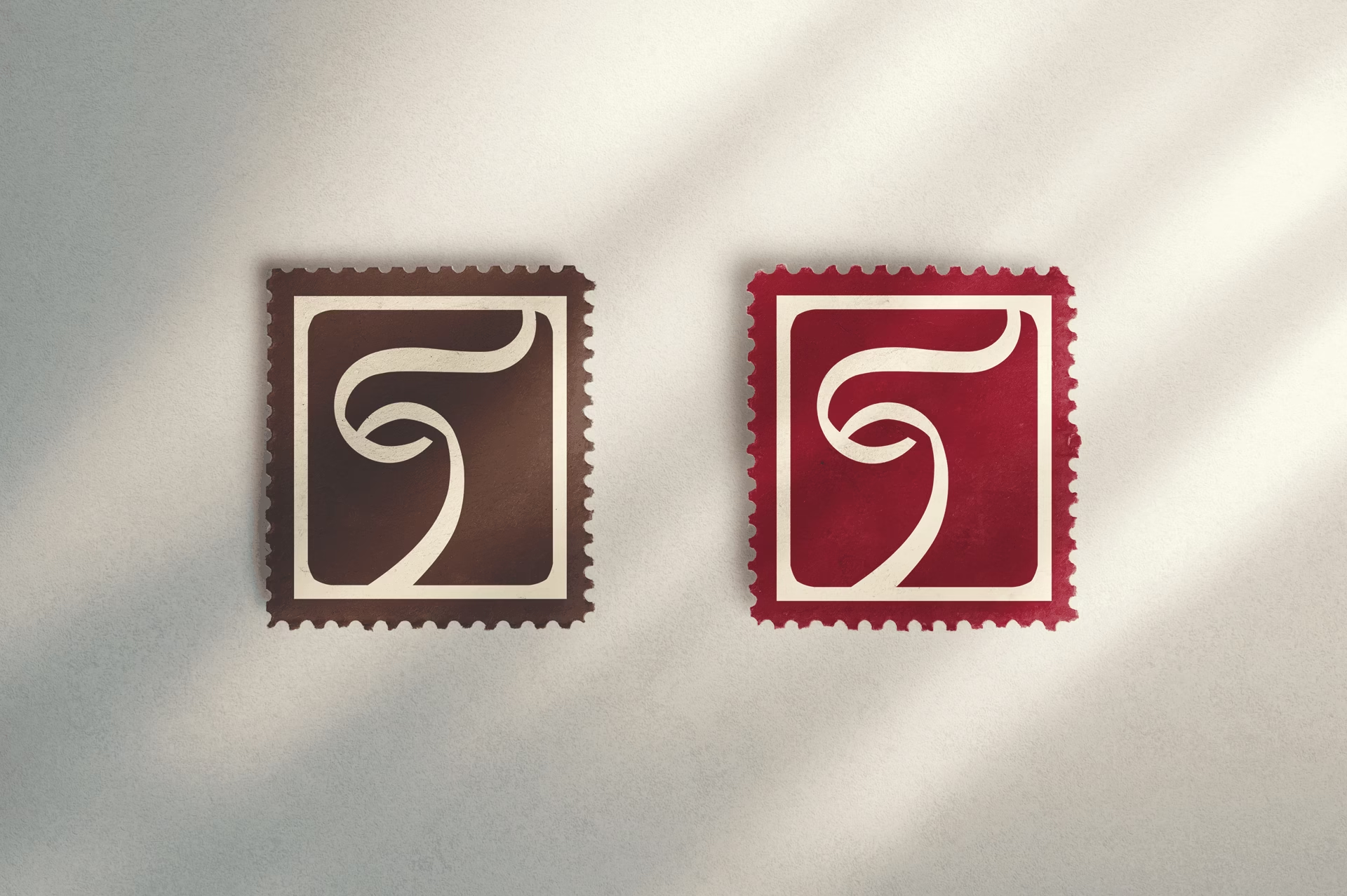
The end result uses a typeface with soft curves and an earthy, human quality, striking a balance between warmth and authority. This sensibility extends into the symbol, a stamp built from the font’s shapes to form an abstract face. The eye at its center holds two meanings: it can be read as Rachel’s own gaze, one that sees each woman and curates an experience around her needs, or as the client’s gaze, seeking direction on her wellness journey.