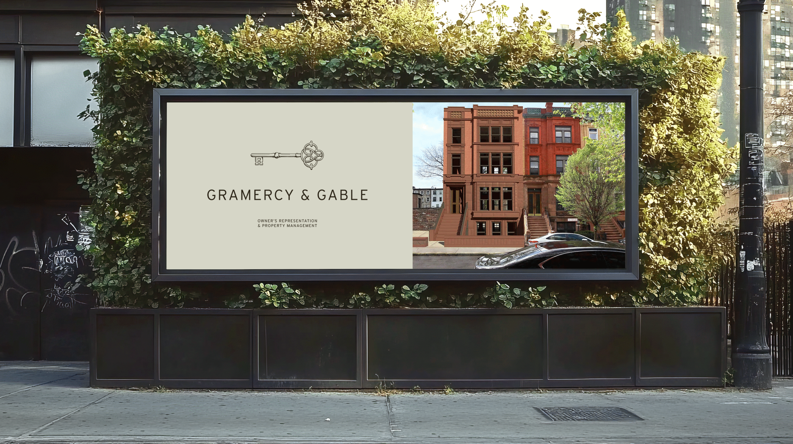
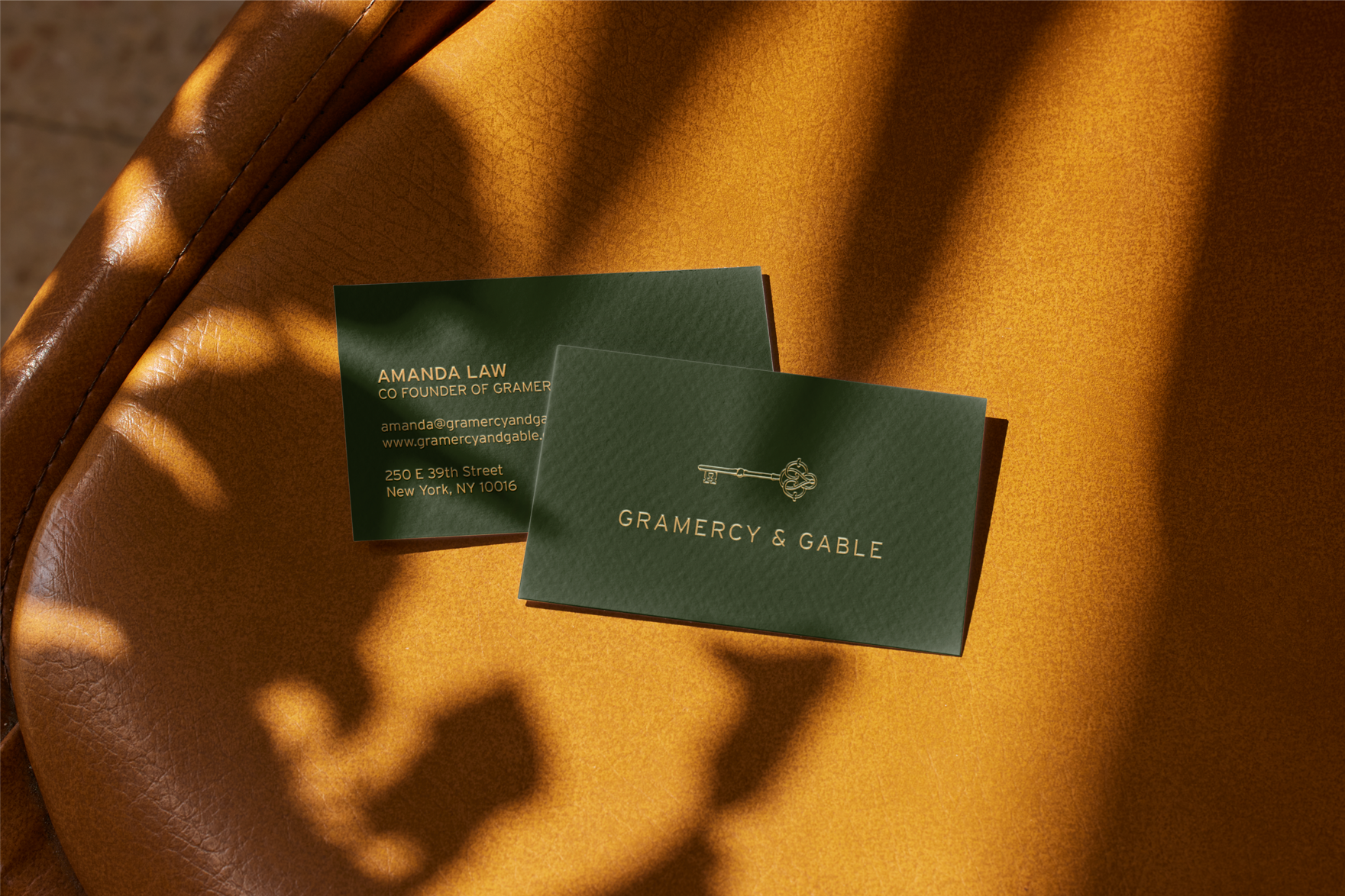
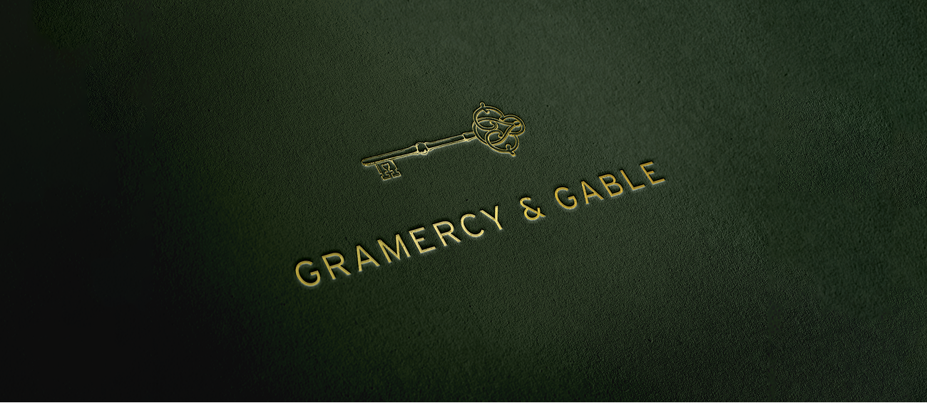
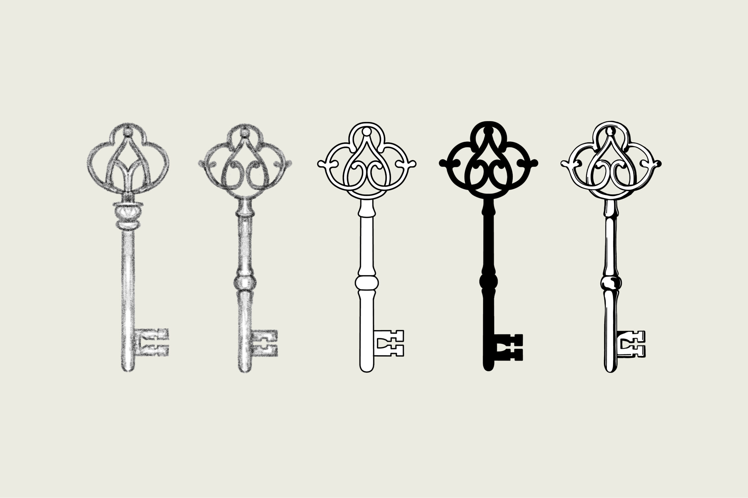
With more than four decades of combined expertise in luxury property management, the founders envisioned a brand that would embody the quiet sophistication and enduring elegance of old New York. The challenge was to craft an identity that felt less like a start-up and more like a legacy institution, rooted in history yet resonant today. The solution emerged in a hand-drawn key featuring different lineweights and subtle imperfections to create a sense of character and richness. Paired with a simple sans serif wordmark, the logo feels timeless, classic, and like it’s been around for decades.
With a name like Gramercy & Gable, the logo naturally drew inspiration from New York’s exclusive Gramercy Park. The custom key symbol uses motifs from the park’s decorative wrought-iron gates and geometry from the aerial view of the landscape. The key’s head is formed by two mirrored “G”s, further giving the design a historic and bespoke feel, embodying both heritage and modern refinement.