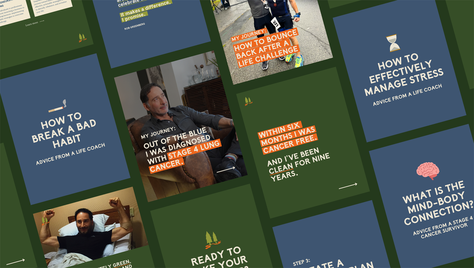
Rob Greenberg’s life coaching brand, The Evergreen Path, presented a rare challenge: to translate a deeply personal life journey into a visual identity that communicates both the business and wellness aspects of his coaching service. As an entrepreneur turned public company officer, father, and Stage 4 lung cancer survivor, Rob embodies strength and authenticity. To launch his new venture, Rob required a brand identity that felt unmistakably his, one that could carry the weight of his story while projecting trust, credibility, and warmth to those seeking guidance.
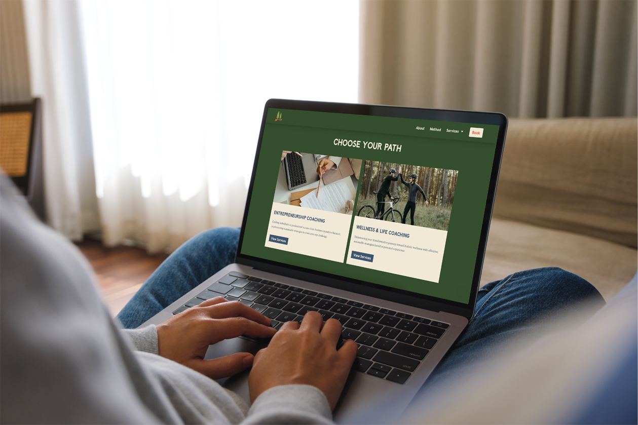
Branding & Identity, Creative Direction, Graphic Design, Media Production, Social Media, Video Editing, Website Design & Development
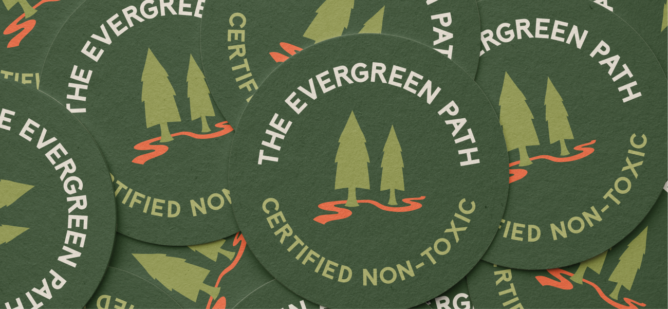
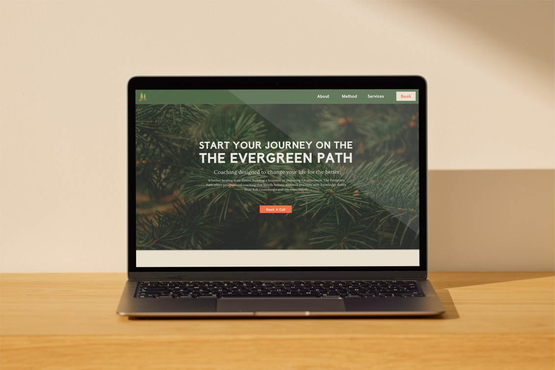
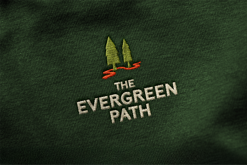
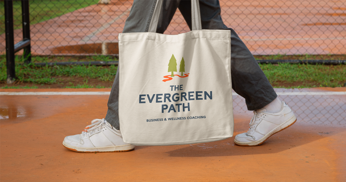
The logo draws from Rob’s core brand pillars of approachability, empowerment, professionalism, compassion, and wisdom. Two rounded tree forms represent coach and client, while a bright orange path winding between them symbolizes the journey toward growth. Paired with a bold sans serif wordmark, the identity captures both strength and warmth, and ensures Rob’s branding feels applicable in health, wellness, and business contexts.