
JTAV Clinical Skincare
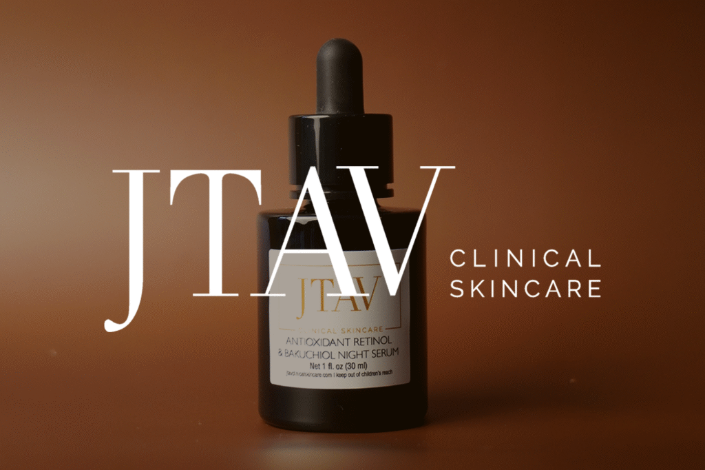
Follower Growth on Tiktok 0 % JTAV PRODUCT ADVERTISEMENTS SKINCARE EDUCATION SKINCARE TIPS PRODUCT PHOTOGRAPHY PRODUCT REVIEWS & RECOMMENDATIONS
Beyonderway
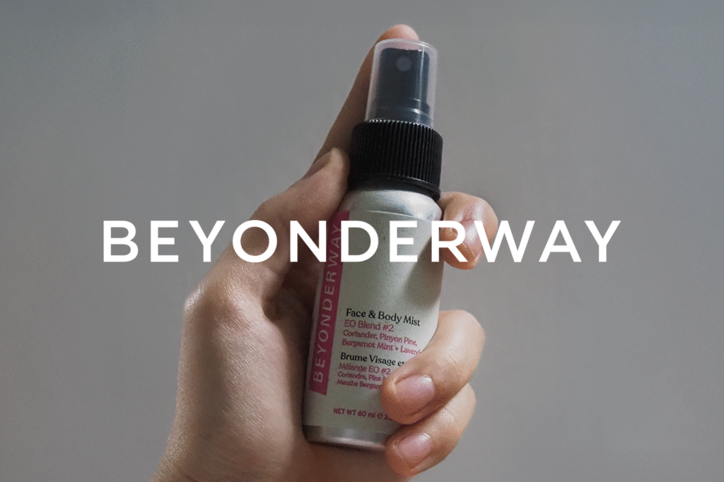
Follower Growth on Tiktok 0 % Views on Pinterest 0 K+ Auidence Growth on Pinterest 0 % AESTHETICALLY RICH CONTENT HOLIDAY CAMPAIGN PRODUCT PHOTOGRAPHY UGC-INSPIRED CAMPAIGN EDUCATIONAL CONTENT
JIA JIA Jewelry
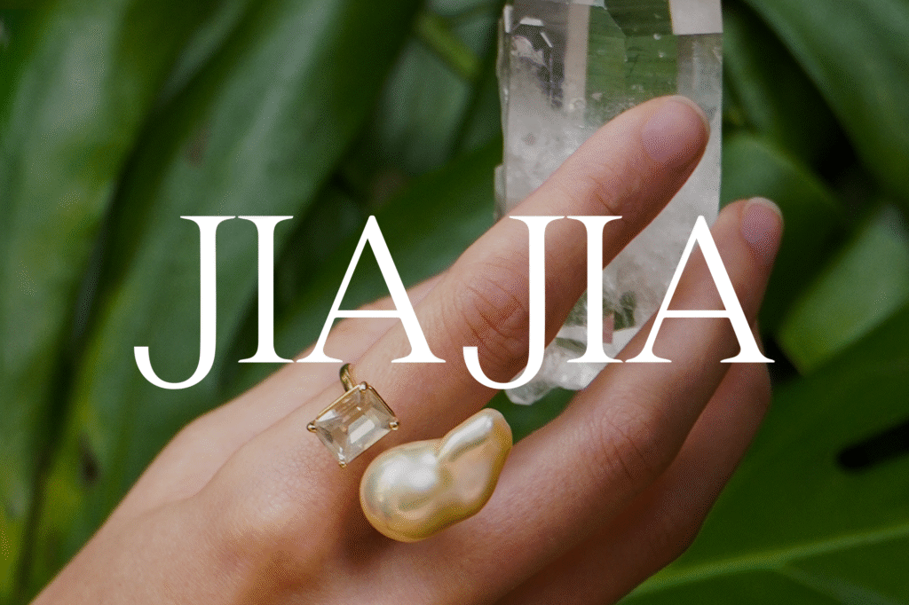
Accounts Reached 0 M+ Content Interactions 0 K+ External Link Taps 0 K+ Instagram Follower Growth 0 % RAINBOW CHAKRA COLLECTION January Campaign New Years Campaign CRYSTAL BUDDHA COLLECTION SWEET SUMMER PINNED POSTS SUMMER STONES FOUNDER-FORWARD CONTENT JEWEL TONED TABLESCAPE VALENTINE’S DAY December Campaign Spring Campaign Behind-the-Scenes BIRTHSTONE GUIDE RUBY TABLESCAPE JIA-JIA WHAT ARE YOU […]
Gramercy And Gable
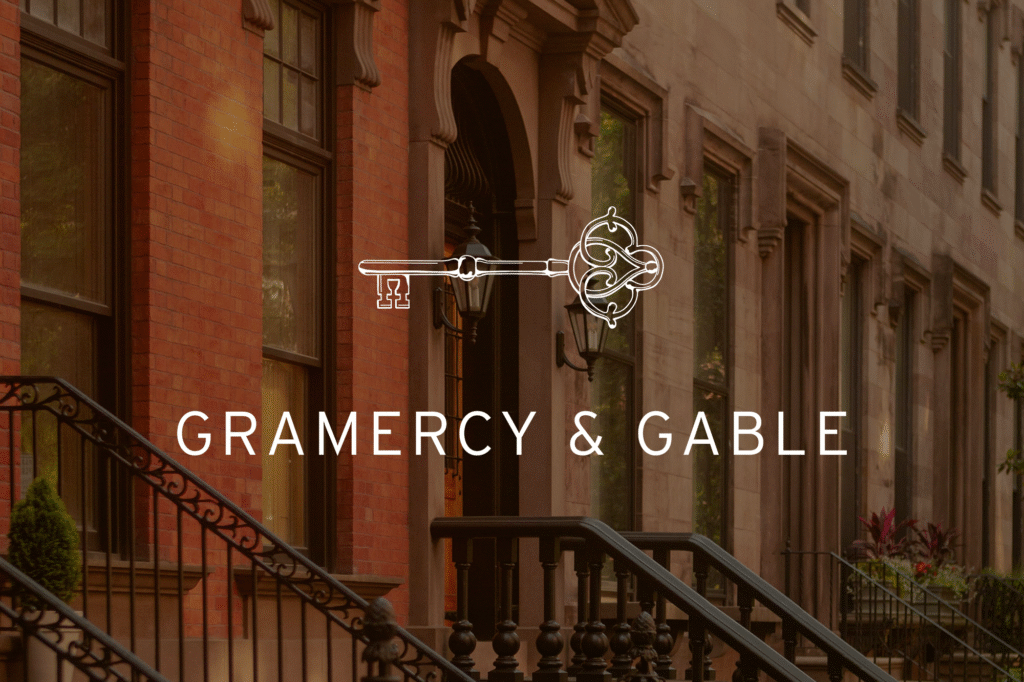
With a name like Gramercy & Gable, the logo naturally drew inspiration from New York’s exclusive Gramercy Park. The custom key symbol uses motifs from the park’s decorative wrought-iron gates and geometry from the aerial view of the landscape. The key’s head is formed by two mirrored “G”s, further giving the design a historic and […]
The Evergreen Path
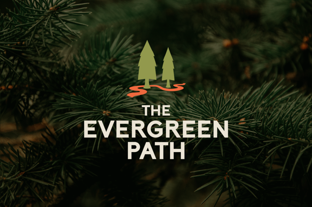
The logo draws from Rob’s core brand pillars of approachability, empowerment, professionalism, compassion, and wisdom. Two rounded tree forms represent coach and client, while a bright orange path winding between them symbolizes the journey toward growth. Paired with a bold sans serif wordmark, the identity captures both strength and warmth, and ensures Rob’s branding feels […]
