TOPSDRS
Hackberry Lane
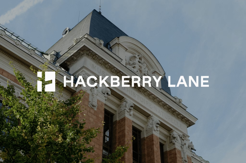
The design language draws from the authority of established real estate firms alongside the refined sensibility of modern, youth-driven brands. The Hackberry Lane symbol features a street sign embedded within the negative space of a rectangle, a reference to the brand’s origin on Hackberry Lane at the University of Alabama, while subtly forming an H […]
Evergreen Mechanical
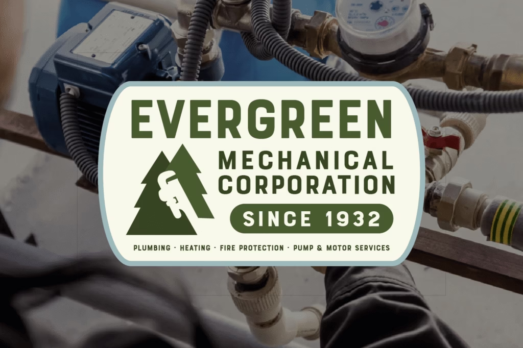
The logo draws from Rob’s core brand pillars of approachability, empowerment, professionalism, compassion, and wisdom. Two rounded tree forms represent coach and client, while a bright orange path winding between them symbolizes the journey toward growth. Paired with a bold sans serif wordmark, the identity captures both strength and warmth, and ensures Rob’s branding feels […]
Book The Bars
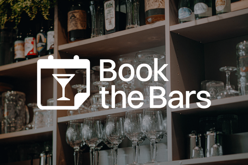
The creative solution was a refined yet memorable logo system: a calendar icon featuring a martini glass, symbolizing that the next great night out is already on your schedule. The detail of the upturned corner invites the viewer further into the app. The illustration is pared back for legibility at app-icon scale but retains a […]
Excuse My Grandma
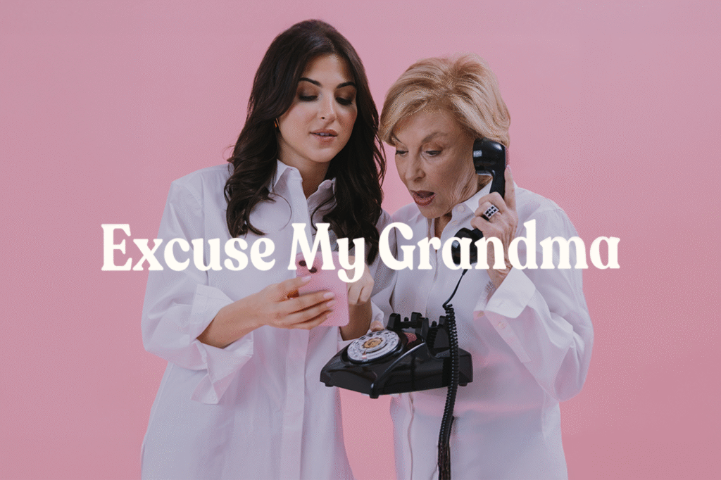
Follower Growth Across Platforms 0 % Average Monthly Views Across Platforms 0 M Total Followers Across Platforms 0 M+ MOTHER’S DAY COMMUNITY EVENT PODCAST PRODUCTION NYC DINER HAT CAMPAIGN NYC TAXI HAT CAMPAIGN MACY’S BRAND PARTNERSHIP THE RAINMAKER RED CARPET DANCING WITH THE STARS RED CARPET AMAZON BRAND PARTNERSHIP 200TH EPISODE FAMILY DINNER BEHIND-THE-HATS ARTHUR […]
Studio IRHA
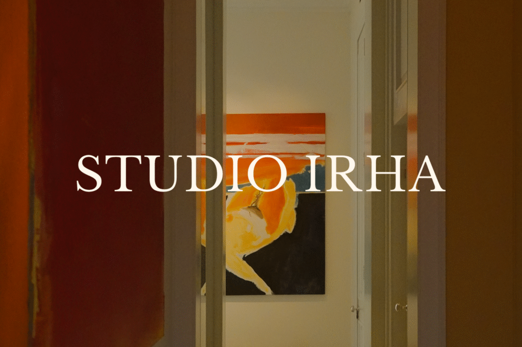
The identity centers on a window symbol, an easily recognizable architectural element that also represents looking out or into a new space. A rising sun completes the mark, representing how IRHA draws out the full potential of each project, from new builds to historic restorations. Refined serif typography reinforces the brand’s prestige and distinguishes it […]
Gramercy And Gable
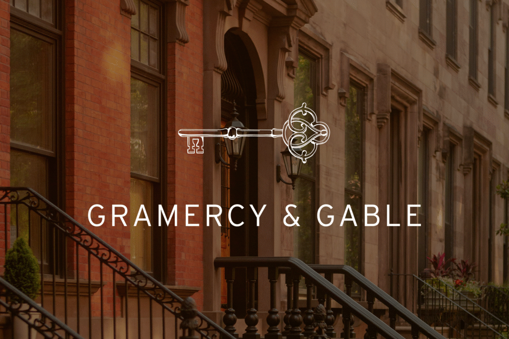
With a name like Gramercy & Gable, the logo naturally drew inspiration from New York’s exclusive Gramercy Park. The custom key symbol uses motifs from the park’s decorative wrought-iron gates and geometry from the aerial view of the landscape. The key’s head is formed by two mirrored “G”s, further giving the design a historic and […]
The Evergreen Path
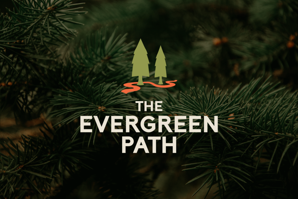
The logo draws from Rob’s core brand pillars of approachability, empowerment, professionalism, compassion, and wisdom. Two rounded tree forms represent coach and client, while a bright orange path winding between them symbolizes the journey toward growth. Paired with a bold sans serif wordmark, the identity captures both strength and warmth, and ensures Rob’s branding feels […]